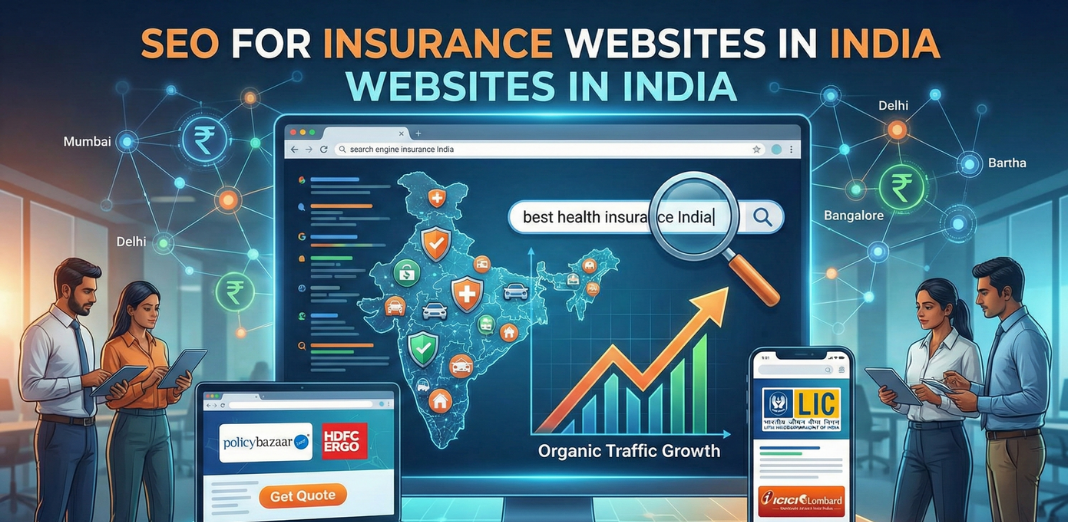
SEO & Lead Generation
  Google Adwords Management
 Social Media Management
 Ecommerce Marketing
 WordPress & Shopify Services
 Website & App Designing
  Website Speed Optimization
  Website Hosting Services
  Amazon PPC Marketing
  Landing Page Designing
 Logo Designing Services
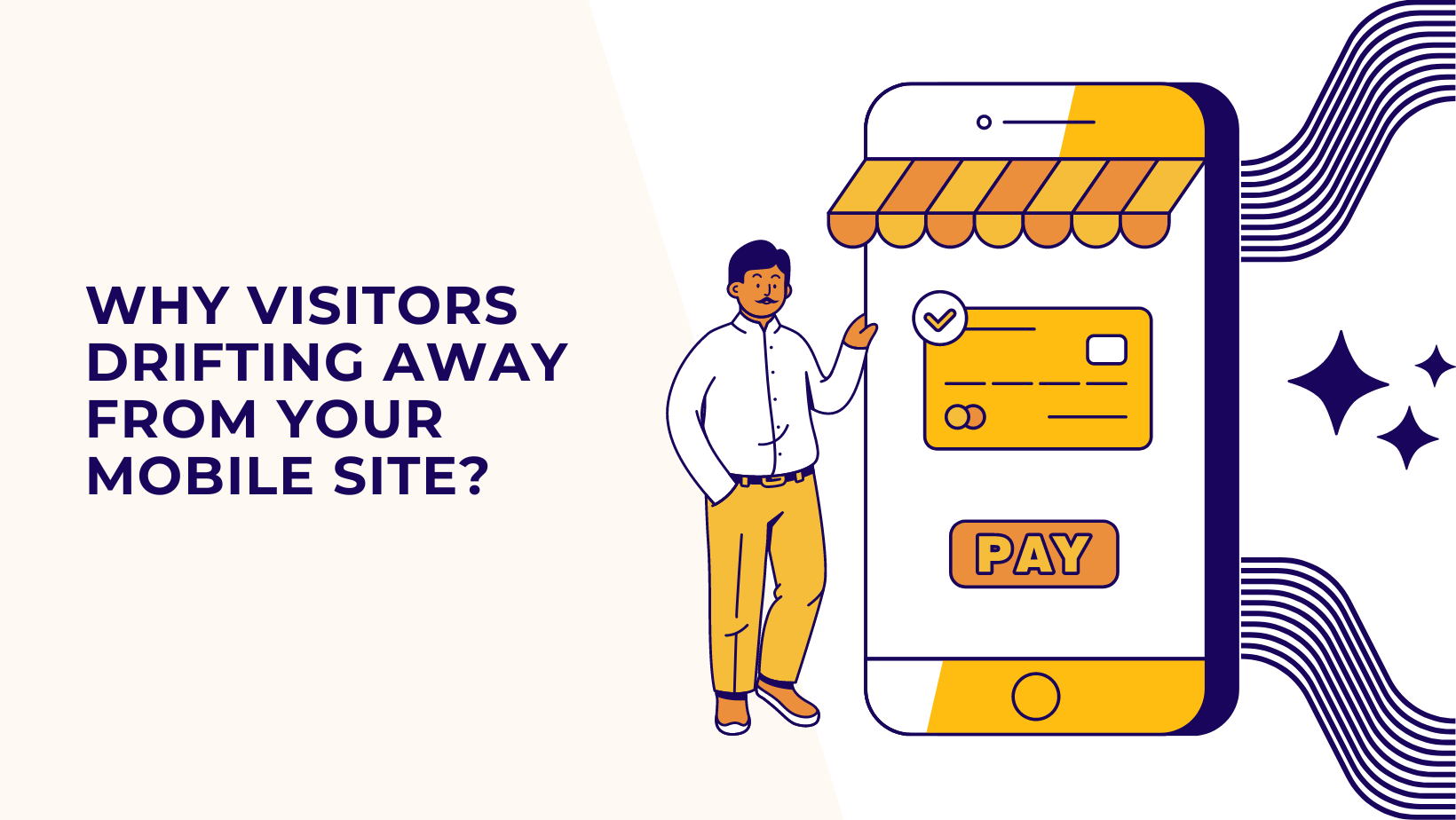

 ×
×
Given the increasing reliance on mobile devices for web browsing, ensuring your website is optimized for mobile users is paramount. According to recent research by Oberlo (2023), mobile phones constituted 51.52% of web traffic in May 2023, with the yearly average standing at 56.86%. Neglecting mobile optimization in your digital marketing strategy could result in the loss of valuable visitors and potential conversions.
This article delves into the hallmarks of a mobile-friendly website design and offers guidance on how to achieve mobile-friendliness. Below are the key topics covered:
Responsive web design (RWD) ensures seamless user experiences across various devices by automatically adjusting the website layout to fit different screen sizes, from desktops to smartphones.
Further optimizations include:
Google’s Mobile Friendly Test offers a quick assessment of a website’s mobile compatibility.
Test results include a mobile device screenshot and a list of detected usability issues, such as:
The process is straightforward: Enter the URL of the page to test and click “Test URL” for immediate feedback.
Investing in professional mobile marketing services can further ensure your website remains current and delivers a seamless mobile experience to users.
When your site is optimized for mobile devices, the outcomes will resemble this:
Conversely, websites with inadequate mobile user experience (UX) design will exhibit this:
Furthermore, the Mobile Friendly Test tool offers insights into areas requiring enhancement for improved usability. Leveraging this information can inform and elevate your future mobile UX design endeavors.
Next on the agenda: We delve into the pitfalls to avoid in mobile-friendly website design and share invaluable tips for achieving mobile optimization.
Investing in mobile UX holds significant importance for companies, directly impacting their Google rankings. Websites offering swift and user-friendly mobile experiences stand a higher chance of ranking well on search engine results pages (SERPs) compared to their competitors.
Outlined below are the primary reasons behind website abandonment and actionable tips for enhancing mobile user experiences:
Google’s announcement in July 2018 emphasized the significance of mobile loading times as a ranking factor. Sluggish load times can adversely affect a website’s organic ranking. Unfortunately, many websites still require approximately 15 seconds to load, according to Google’s analysis.
Furthermore, studies have revealed a substantial 123% increase in bounce rates as page load time escalates from one to 10 seconds.
Solution: To optimize conversion rates, aim for a load time between 0-4 seconds (Portent, 2019). Implement the following strategies to enhance site speed:
The internet is saturated with pop-up ads, banner ads, and sponsored posts. While advertising is essential for brands, an excess of clutter can overwhelm users. Too many competing messages can lead to disconnection from your brand.
Solution: Rather than inundating users with numerous ad messages, adopt a targeted approach. Define your target audience precisely and customize your messaging to resonate with them. Concentrate on generating meaningful content that aligns with the interests of your ideal audience.
This approach not only enhances the mobile experience but also strengthens the bond between the brand and the customer, fostering long-term benefits
Simply driving traffic to your website isn’t sufficient; you need visitors to engage with your offerings. This necessitates a clear directive on what action you want users to take—whether it’s making a purchase, subscribing to a newsletter, or downloading an app.
Solution: When crafting a call-to-action (CTA) button, explicitly specify the desired action. Utilize vibrant colors, compelling visuals, and succinct text to encourage users to take the intended action.
A/B testing is invaluable for determining the most effective CTAs. This involves experimenting with various versions of a page element to identify the optimal performer. Once you’ve pinpointed what resonates best, leverage it as a blueprint for future campaigns.
Stale or incongruous content can swiftly deter visitors. Even if your website boasts swift loading times and seamless navigation, its impact is diminished if the content fails to align with the user’s search intent.
Solution: To mitigate this issue, consistently refresh your website with up-to-date content, precise product descriptions, and relevant information. Stay attuned to customer feedback, industry trends, and competitor insights to identify pertinent topics.
Incorporating user-generated content (UGC) can showcase your website as a vibrant community hub, fostering engagement and bolstering conversion rates.
Moreover, enhance your website’s organic search visibility by strategically integrating keywords into meta tags, title tags, and content body.
Extensive, unstructured blocks of text can overwhelm and deter readers. Thus, it’s crucial to break down your content into manageable chunks, allowing users to swiftly navigate through the material.
Solution: Enhance user experience by employing concise paragraphs, bullet points, and clear headings to facilitate readability and comprehension.
Chunking, the practice of segmenting text into smaller sections, proves particularly beneficial for addressing complex subjects. This approach enables readers to easily locate and reference the sections most pertinent to their interests.
Additionally, incorporating visual elements such as images, videos, quotes, and headings can effectively break up dense text blocks, making it simpler for users to absorb the provided information.
Whether accessed via desktop or mobile, your website’s design holds significant sway over its credibility. In fact, a staggering 75% of users base their assessment of a company’s legitimacy solely on its design.
Solution: Embrace a professional, contemporary web design to elevate your brand’s presence and cultivate trust among visitors. Strive for aesthetic appeal without compromising functionality.
Consistent color schemes across all platforms are pivotal for fostering a unified brand identity. Incorporate original imagery and maintain consistency in font selections to further reinforce brand coherence.
Engaging a skilled web design and development team can ensure your website exudes polish and professionalism. When executed effectively, an impeccable website design facilitates a compelling first impression, setting the stage for positive interactions with new visitors.
A considerable portion of users may not scroll beyond the top of the screen. To optimize user engagement, Amber suggests locating crucial buttons and text near the top of the page, but exercise caution to avoid overwhelming it.
Solution: Situate CTA buttons “above the fold” on landing pages or at the page’s outset, ensuring visibility to users without the need for scrolling. Maintain succinct and straightforward text, enabling users to grasp the desired action promptly without scrolling.
Users frequently navigate through websites with extensive content by scrolling down multiple times. However, it can become cumbersome for them to backtrack just to access the navigation menu.
Solution: To mitigate this inconvenience, contemplate integrating a sticky navigation menu that remains visible on the screen as users scroll.
“We’ve conducted tests on this at Thrive and observed that sticky navigations tend to enhance engagement with the menu, thus increasing the likelihood of users exploring other pages on the site,” noted Warner.
For a comprehensive evaluation of your website’s user experience, consider leveraging mobile marketing services. With an effective mobile strategy, you can identify crucial features that contribute to creating an exceptional user experience.
In conclusion, enhancing user experience and crafting a high-converting website is paramount for digital success, and Kleverish offers the tools and expertise to achieve these goals effectively. By prioritizing user-centric design, implementing intuitive navigation, and optimizing for mobile responsiveness, Kleverish empowers businesses to create engaging online experiences that resonate with their audience. Through thoughtful attention to detail and a commitment to excellence, Kleverish ensures that every visitor journey is seamless, memorable, and ultimately drives conversions. With Kleverish as your partner, you can elevate your online presence, captivate your audience, and achieve your business objectives with confidence.

Pinal Bhalodia is a multi-faceted professional with a diverse skill set spanning creative website design, Google Adwords, Search Engine Optimzation , IT expertise, and sales acumen. With a passion for blending technology with artistic flair, Pinal has carved a niche for himself in the dynamic intersection of these fields.

 Rated 4.99/5 overall
across 100+ reviews
Rated 4.99/5 overall
across 100+ reviews